Why Printed Colors Look Different From Screen Colors | Printing Tips
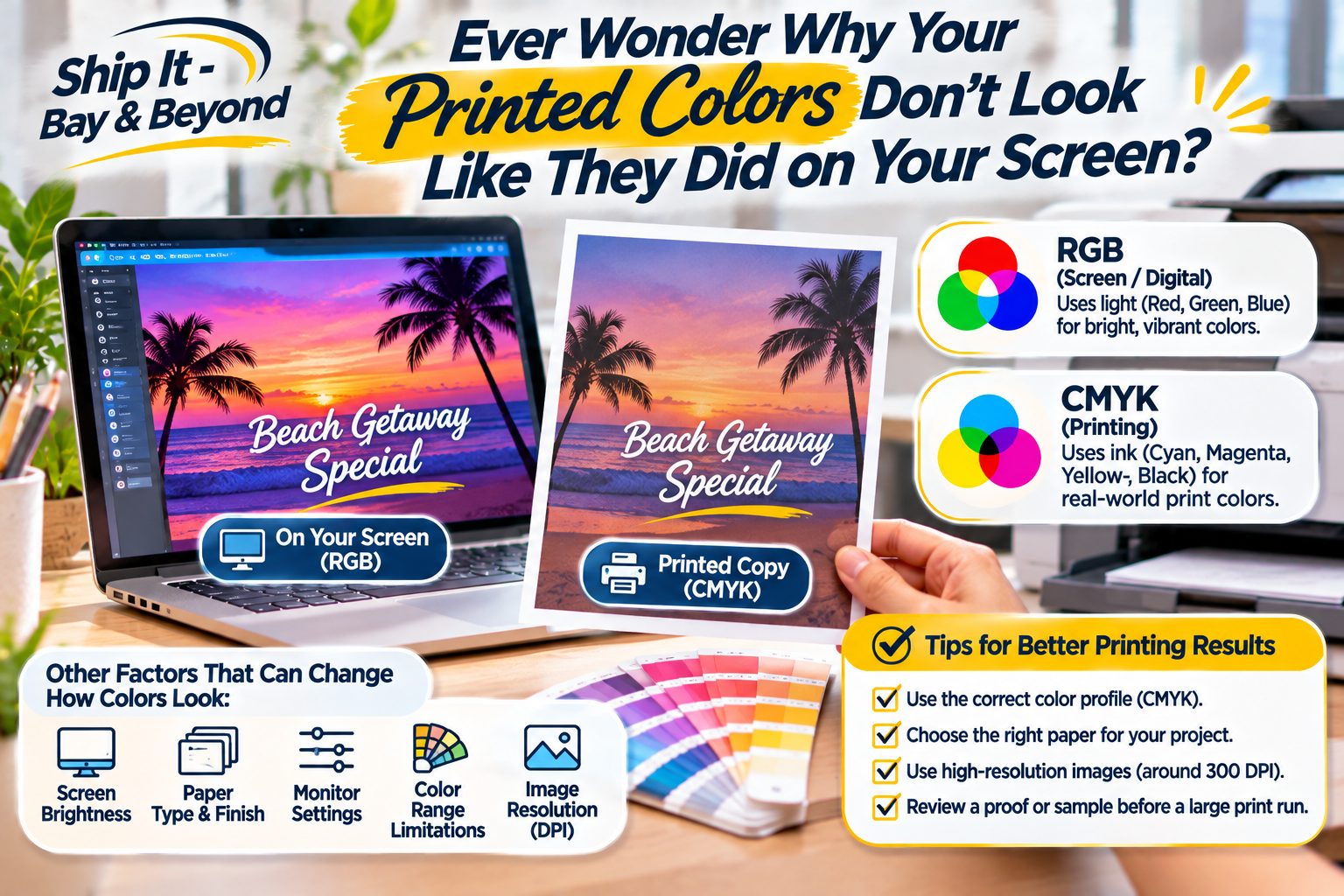
Ever Wonder Why Your Printed Colors Don't Look Like They Did on Your Screen?
Introduction
Have you ever spent hours perfecting a design on your computer, only to receive the printed copies and wonder why the colors look completely different?
That bright blue looks darker. The vibrant green seems duller. The beautiful pink you selected appears slightly purple. What happened?
Don't worry—this is one of the most common surprises in the printing world!
The difference usually comes down to how screens and printers create color. Your computer, tablet, and phone use light to display colors, while printers use ink or toner on paper. Understanding this difference can help you avoid unexpected results and get printed materials that look closer to your original design.
Let's break down why it happens and what you can do before sending your next project to print.
1. Screens and Printers Use Different Color Systems
One of the biggest reasons printed colors look different is that screens and printers use two different color models: RGB and CMYK.
What Is RGB?
RGB stands for Red, Green, and Blue.
Your phone, laptop, tablet, and television use this color system. Screens combine different amounts of red, green, and blue light to create the colors you see.
Because screens produce light, colors can appear bright, vibrant, and even glowing.
What Is CMYK?
CMYK stands for Cyan, Magenta, Yellow, and Key (Black).
This color model is commonly used in professional printing. Instead of creating colors with light, printers combine layers of ink or toner to produce the final image on paper.
This means some bright colors you see on your screen may not be reproducible in the same way using standard printing inks.
The takeaway: A design that looks vibrant on your screen may appear slightly different when printed because the two systems create color differently.
2. Your Screen May Be Brighter Than Your Printed Page
Have you ever turned up your phone or laptop brightness to make a design look better?
That brightness can affect how you perceive colors.
Screens are illuminated, meaning they produce their own light. Printed materials rely on the light in the room reflecting off the paper.
For example:
Bright colors may appear more vivid on a screen.
Dark colors may look deeper or richer on a monitor.
Printed colors may appear softer or less saturated.
Subtle color differences may become more noticeable on paper.
Even if your design file is correct, the lighting and screen settings can influence how you see it.
3. Your Monitor May Not Be Calibrated
Not all screens display colors the same way.
A design viewed on one computer may look slightly different on another. Your monitor's brightness, contrast, color temperature, and display settings can all affect how colors appear.
This is why designers often use calibrated monitors when color accuracy matters.
If you're preparing important printed materials, avoid relying entirely on how the design looks on an uncalibrated screen.
4. Paper Type Can Change the Final Color
The paper you choose plays a bigger role in printing than you might think!
Different paper finishes absorb and reflect ink differently, which can affect the final appearance of your design.
Here are a few examples:
Glossy paper: Often makes colors appear brighter and more vibrant because of its reflective finish.
Matte paper: Creates a softer, less reflective appearance.
Uncoated paper: Absorbs more ink, which can make colors appear less saturated.
Textured paper: May affect how evenly ink appears on the surface.
The same design can look noticeably different depending on the paper used.
Before printing a large quantity, consider asking about available paper options and requesting a sample when possible.
5. Not Every Color Can Be Reproduced Exactly
Some colors are simply outside the range that standard printing processes can reproduce.
This is especially common with:
Neon colors
Extremely bright blues and greens
Highly saturated pinks
Certain gradients and special effects
For example, an electric blue displayed on a bright monitor may print as a darker or less vibrant blue.
If exact brand colors are important, ask your print provider about color-matching options, such as Pantone or spot-color printing, when available.
Keep in mind that even special color-matching methods can be influenced by paper, ink, and production conditions.
6. Low-Resolution Images Can Affect Print Quality
Color isn't the only thing that can change between your screen and your printed materials.
Image quality matters, too!
An image that looks perfectly clear on a small phone screen may appear blurry or pixelated when enlarged for printing.
For better results:
Use high-resolution images.
Aim for approximately 300 DPI at the final print size for photographs and detailed raster images.
Use vector artwork for logos and graphics whenever possible.
Avoid repeatedly resizing or compressing images.
Check the final dimensions before submitting your file.
A high-quality design file helps produce a cleaner, more professional-looking printed result.
7. How to Get Better Color Results Before Printing
Want to avoid printing surprises? A little preparation can make a big difference.
Here is a simple checklist to follow before submitting your next printing project:
Before You Print Checklist
Use the correct color profile for your printer or print provider.
Convert RGB artwork to the requested CMYK profile when required.
Check that images have sufficient resolution.
Confirm the final document size and layout.
Review your design on a properly adjusted screen.
Choose the right paper finish for your project.
Request a proof or sample for important projects.
Review the proof carefully before approving a large print run.
Remember, a digital preview is helpful, but a printed proof is often the better way to evaluate the actual appearance of your materials.
How Ship It - Bay & Beyond Can Help
Whether you're printing business cards, flyers, postcards, brochures, marketing materials, or everyday documents, preparing your files correctly can help you get better results.
At Ship It - Bay & Beyond, we offer printing services and design support to help individuals, professionals, and local businesses bring their ideas to life.
Our team can help you prepare for your printing project, review basic file requirements, and discuss available printing options.
Need marketing materials for your business? We can help with projects such as:
Business cards
Flyers and promotional materials
Postcards and mailers
Marketing materials
General document printing
Design services for printing
Have a design ready? Bring it in or contact us to discuss your project before printing.
A little preparation today can help prevent costly reprints tomorrow!
Proudly Serving the Tampa Bay Area
Ship It - Bay & Beyond is proud to support individuals, entrepreneurs, professionals, and businesses throughout St. Petersburg and the greater Tampa Bay Area.
We proudly serve St. Petersburg, Tampa, Clearwater, Largo, Pinellas Park, Seminole, Gulfport, Kenneth City, Treasure Island, St. Pete Beach, Madeira Beach, Indian Rocks Beach, Indian Shores, Redington Beach, North Redington Beach, Redington Shores, Safety Harbor, Oldsmar, Dunedin, Palm Harbor, Tarpon Springs, Belleair, Belleair Bluffs, Lealman, Pinellas County, Hillsborough County, and surrounding communities.
Whether you need professional packing and shipping, printing, a private mailbox, virtual mailbox options, notary services, fingerprinting, secure shredding, document scanning, copying, passport photos, business formation-related services, moving supplies, or other office services, Ship It - Bay & Beyond is your local partner for everyday business needs.
The Bottom Line
The reason your printed colors don't always match your screen isn't necessarily a mistake. It's often the result of different color systems, screen brightness, paper finishes, printer capabilities, and file preparation.
The good news? Understanding these differences can help you make smarter printing decisions and avoid unexpected results.
Before printing hundreds of business cards, flyers, or postcards, take a moment to review your design, confirm the file requirements, and request a proof when needed.
A great design deserves a great print!
Have you ever been surprised by how different your printed colors looked compared to your screen? Share your experience in the comments!
