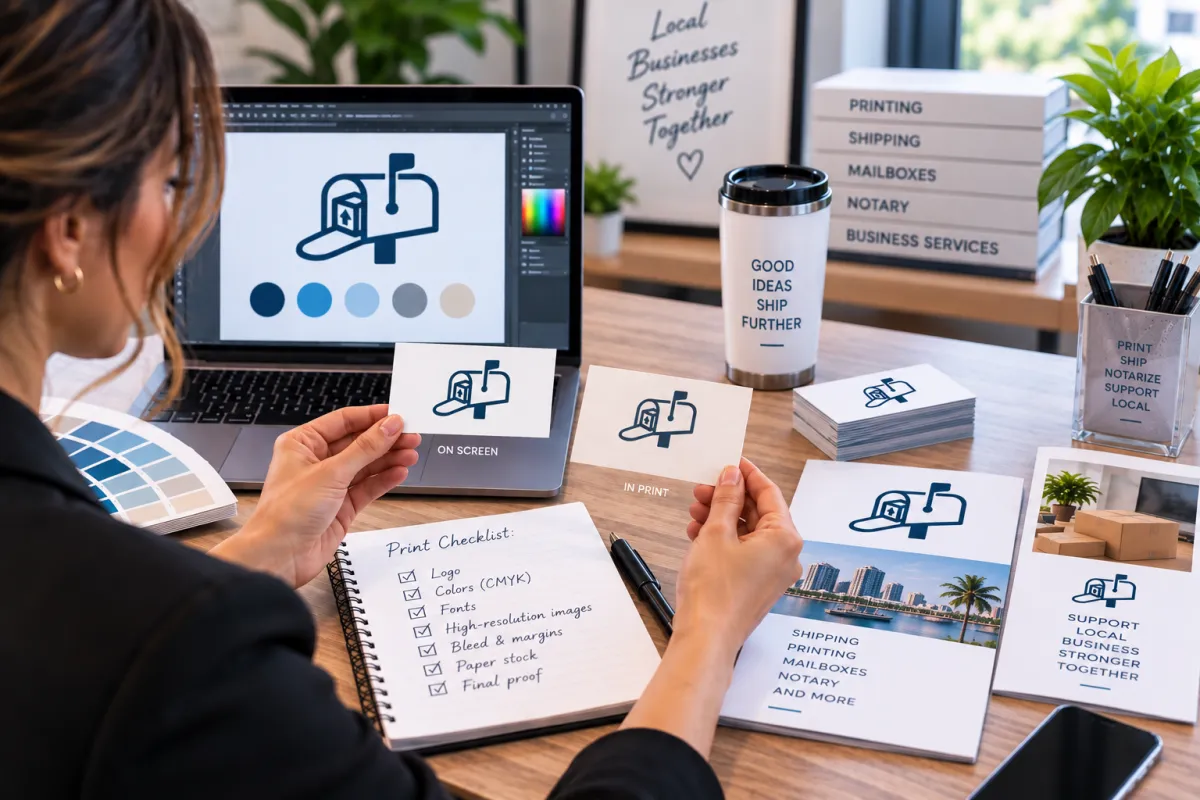
Why Your Brand Looks Different on Paper—and How to Get Better Print Results
Why Your Brand Looks Different on Paper
Your logo looks perfect on your website.
Your colors look great on Instagram.
Your digital ads have exactly the look you wanted.
Then you print a business card or brochure—and suddenly the color looks different.
What happened?
It's a common issue for businesses moving their branding from screens to physical materials.
The good news is that your brand hasn't necessarily changed.
The way color is displayed, reproduced, and perceived has.
Understanding why can help you create printed materials that look much closer to the brand you've built online.
Why Do Colors Look Different in Print?
The biggest reason is simple:
Screens and printers create color differently.
Digital screens generally use RGB color—red, green, and blue light.
Printed materials typically use CMYK inks—cyan, magenta, yellow, and black.
These systems don't reproduce every color in exactly the same way.
A bright blue or vivid green that looks striking on your monitor may appear somewhat different when printed.
That's why a design that looks perfect digitally may need to be prepared specifically for print.
RGB vs. CMYK: What's the Difference?
Understanding these two color systems can make a big difference.
RGB: Designed for Screens
RGB stands for:
Red
Green
Blue
Screens create colors by combining light from these three channels.
This allows displays to produce extremely bright and vibrant colors.
RGB is commonly used for:
Websites
Social media
Digital advertisements
Mobile apps
Online graphics
CMYK: Designed for Printing
CMYK stands for:
Cyan
Magenta
Yellow
Key/Black
Printers combine these inks to reproduce colors on physical materials.
CMYK is commonly used for:
Business cards
Flyers
Brochures
Postcards
Marketing materials
Printed documents
Because ink and light behave differently, an exact visual match between screen and paper isn't always possible.
Your Monitor Isn't a Perfect Color Reference
There's another factor many businesses overlook:
Your screen itself.
Two people can open the exact same design on different monitors and see slightly different colors.
Why?
Screens can vary in:
Brightness
Contrast
Color temperature
Display technology
Calibration
Manufacturer settings
A color that appears slightly warmer on one monitor may look cooler on another.
That means the color you see on your screen isn't necessarily an exact representation of what a printer will produce.
Paper Changes How Color Looks
The printer isn't the only variable.
Paper matters, too.
Different paper stocks can absorb and reflect ink differently.
For example, a color printed on a bright, coated stock may look different from the same color printed on an uncoated stock.
Paper can affect:
Brightness
Contrast
Sharpness
Saturation
Texture
Overall appearance
This is particularly important for brands that rely heavily on specific colors.
The same design can have a noticeably different feel depending on the material it's printed on.
Coated vs. Uncoated Paper
One of the most useful distinctions to understand is coated versus uncoated stock.
Coated Paper
Coated paper has a smoother surface and can provide a cleaner, sharper appearance.
It's often used for:
Brochures
Marketing materials
Postcards
High-quality promotional pieces
Uncoated Paper
Uncoated paper has a more natural, tactile surface.
It's commonly used for:
Letterhead
Forms
Business stationery
Some business cards
Neither is automatically better.
The right choice depends on the purpose and the look you're trying to achieve.
The Finish Can Change the Appearance
Even after choosing a paper type, the finish can influence how your colors appear.
Options such as matte and glossy finishes can affect how light interacts with the surface.
A glossy finish may make certain colors appear more vibrant.
A matte surface can create a softer, more understated appearance.
This is why choosing a print material isn't just a technical decision.
It's part of your brand presentation.
Your Logo Needs to Work Beyond the Screen
A logo may look fantastic on a website but still need consideration for physical applications.
Think about where your logo might appear:
Business cards
Brochures
Flyers
Packaging
Signs
Letterhead
Promotional materials
Shipping materials
A strong visual identity should remain recognizable across different formats.
That doesn't necessarily mean every application will look absolutely identical.
It means the brand should maintain a consistent visual character.
Why Small Color Differences Can Matter
Imagine a business consistently uses a specific deep blue online.
Then its printed brochure uses a blue that looks noticeably brighter or more purple.
Individually, the difference may seem minor.
But repeated across multiple materials, inconsistent colors can make the brand appear less coordinated.
This is especially noticeable when a business uses print frequently.
Consistency can help reinforce brand recognition.
Images Can Change, Too
Color isn't the only thing that can look different on paper.
Photographs can change depending on:
Resolution
Color profile
Printing process
Paper stock
Image quality
Lighting
A photo that looks crisp on a high-resolution phone display may not print well if the original file is too small.
That's why image quality matters before a design ever reaches the printer.
Resolution Matters for Printed Materials
Digital images are often discussed in terms of pixels.
Printed images are commonly evaluated using DPI, or dots per inch.
If an image doesn't contain enough information for the intended print size, it may appear:
Blurry
Pixelated
Soft
Jagged
Simply enlarging a low-resolution image doesn't necessarily create additional detail.
For professional print projects, it's important to use appropriately sized, high-quality source images.
Why Print-Ready Files Matter
A design isn't automatically ready for professional printing just because it looks good on your computer.
A print-ready file may need appropriate:
Color settings
Resolution
Dimensions
Bleed
Margins
Fonts
Image quality
File format
For example, bleed provides extra image or background area beyond the final trim edge.
Without appropriate bleed, a design intended to extend to the edge may leave an unwanted white border after trimming.
Don't Forget the Trim Area
Printed materials are physically cut to their final size.
That means important information shouldn't sit too close to the edge.
Keep critical elements such as:
Contact information
Logos
Phone numbers
Website addresses
QR codes
within an appropriate safe area.
A professional print setup helps reduce the risk of important elements being cut off or appearing uncomfortably close to the edge.
Why a Printed Proof Can Be Useful
If color consistency is particularly important, consider reviewing a proof before producing a large quantity.
A proof gives you an opportunity to evaluate the physical result rather than relying entirely on your monitor.
You can examine:
Color
Layout
Image quality
Text
Paper
Overall appearance
This can be especially useful for important branding projects or larger print runs.
Build a Brand That Works in Both Worlds
Modern businesses often live in two environments.
Digital
Website
Social media
Email
Online advertising
Digital presentations
Physical
Business cards
Flyers
Brochures
Packaging
Signage
Printed documents
Your brand should be recognizable in both.
That doesn't mean every color will look mathematically identical across every medium.
It means the overall identity remains cohesive.
A Simple Print-Consistency Checklist
Before sending a branded project to print, consider:
✓ Is the file prepared for print?
Check dimensions, resolution, bleed, and other requirements.
✓ Are the colors appropriate for the printing process?
Consider whether the artwork is properly prepared for the intended output.
✓ Are your images high enough quality?
Avoid stretching small or low-resolution images unnecessarily.
✓ Is the paper appropriate?
Think about the purpose, audience, and desired appearance.
✓ Is important information inside the safe area?
Keep critical text and logos away from trim edges.
✓ Does the design represent your brand?
Check fonts, logo usage, imagery, spacing, and overall consistency.
✓ Would a proof be helpful?
For important projects, seeing a physical sample can reveal differences you won't notice on screen.
When You Should Consider Professional Printing
DIY printing can be perfectly reasonable for some everyday documents.
But professional printing may make sense when you're producing materials that represent your business publicly.
Consider professional printing for:
Business cards
Brochures
Marketing campaigns
Flyers
Postcards
Event materials
Presentation materials
Branded collateral
Your printed materials are often part of your customer's first impression.
They deserve the same attention as your website and social media presence.
How Ship It - Bay & Beyond Can Help
At Ship It - Bay & Beyond, we help businesses take their digital designs and turn them into professional physical materials.
Our printing and document services can support:
Business cards
Flyers
Brochures
Marketing materials
Documents
Copies
Scanning
Presentation materials
Other business printing needs
We also provide complementary services that help businesses manage their physical operations, including:
Professional packing and shipping
Private mailboxes
Virtual mailbox services
Package receiving
Secure document shredding
Notary services
Fingerprinting
Passport photos
Business formation support
Office services
If you've spent time building a recognizable digital brand, professional printing can help carry that identity into the physical world.
Proudly Serving the Tampa Bay Area
Ship It - Bay & Beyond proudly serves:
St. Petersburg
Tampa
Clearwater
Largo
Pinellas Park
Seminole
Gulfport
Kenneth City
Treasure Island
St. Pete Beach
Madeira Beach
Indian Rocks Beach
Indian Shores
Redington Beach
North Redington Beach
Redington Shores
Safety Harbor
Oldsmar
Dunedin
Palm Harbor
Tarpon Springs
Belleair
Belleair Bluffs
Lealman
Pinellas County
Hillsborough County
Surrounding communities
Whether you need professional packing & shipping, printing, a private or virtual mailbox, notary, fingerprinting, secure shredding, document scanning, copying, passport photos, business formation, or office services, Ship It - Bay & Beyond is your trusted local partner.
The Bottom Line
If your brand looks slightly different on paper, you're not necessarily doing anything wrong.
Screens and printers simply create color differently.
The final appearance can also be influenced by:
Color mode
Monitor settings
Paper stock
Finish
Ink
Image quality
File preparation
Printing equipment
Understanding these factors can help you make better decisions before sending your next project to print.
Your digital presence may be where customers first discover you.
But your printed materials can become something they hold, keep, share, and remember.
